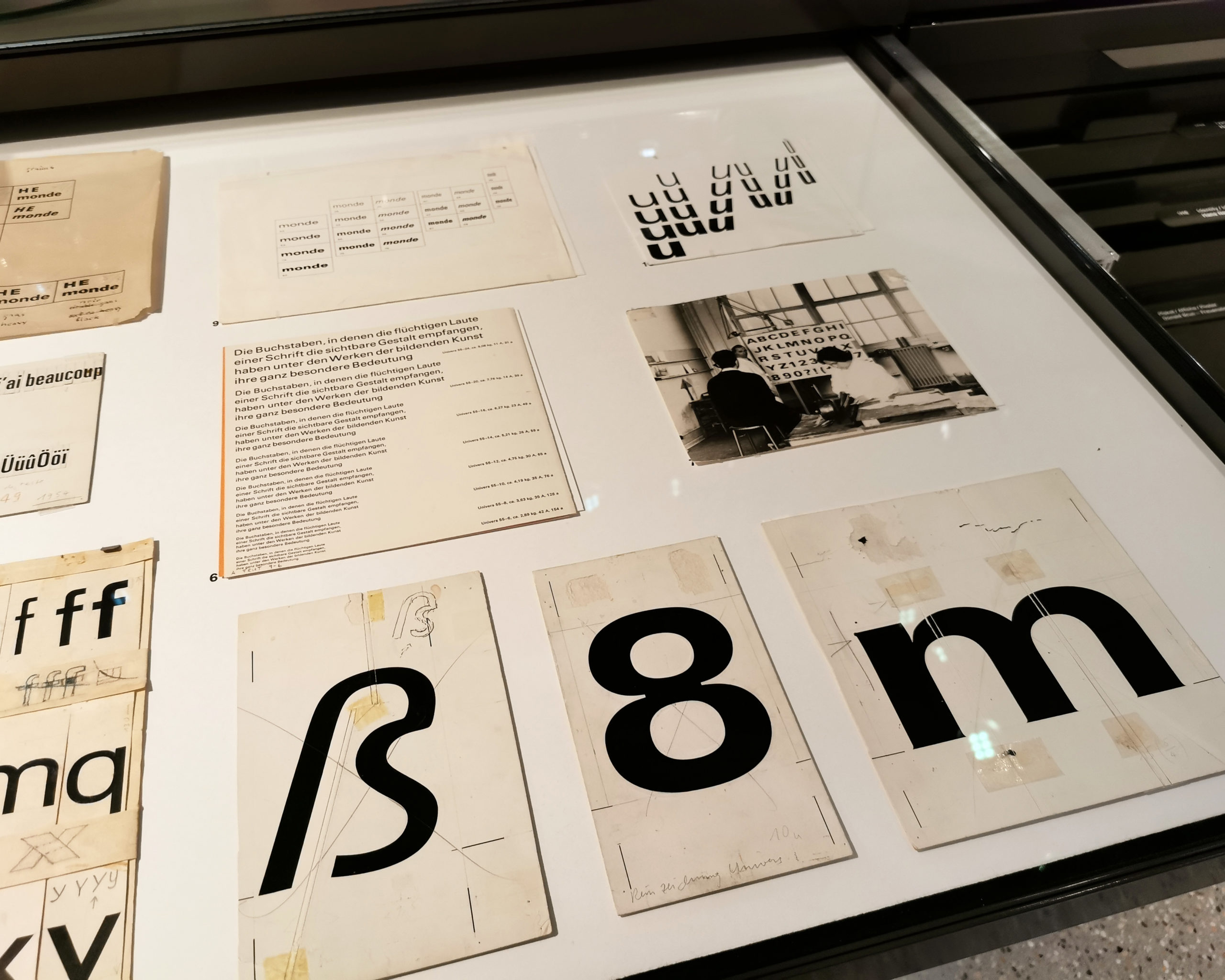
My trip to the Museum für Gestaltung in Zürich to see the original sketches for the Univers font.
Over Christmas, I read a book on typography. As a field, it is not something I ever thought about beyond choosing French Script MT for every school essay and avoiding Comic Sans at all costs. Knowing I would be joining the UX Design MA with Falmouth, I picked up Just My Type by Simon Garfield to expand my knowledge of design basics. Upon finishing it, I realised I was utterly wrong in assuming I was ok typography-knowledge-wise. I know nothing!
Reading one book doesn’t make anyone an expert, but I gained a lot from reading it. It has given me a deep appreciation for the surgical precision that goes into type development. Although, it is now a struggle to walk down the street and not stop at every sign or advert with a pretty font!
Considering typography in the broader context of the field, I get the impression that a deep knowledge of type is beneficial but not particularly impressive or appreciated. This knowledge will simply make my life easier when it comes to designing. Also, consuming this information gives me a better footing in graphic design as I slowly build up my practical UX skills.
Now that I have this reflective journal to maintain, I will reference Just My Type and begin playing around with various body text and heading fonts to see if I can find something that represents me a little better than [default theme font].
Fun Fact: Comic Sans was developed by Vincent Connare as a friendly typeface to improve a software package called Microsoft Bob. Bob was, however, released to the public with Times New Roman and was a commercial failure (Garfield 2010). Who knows if Comic Sans would have helped.
References
GARFIELD, Simon. 2010. Just My Type: A Book about Fonts. London: Profile Books.
German vocabulary of the week
Typography – Typografie
Font – Schriftart
