Wavelength
My role
This was a self-directed research and design project. I worked on low- to high-fidelity prototypes, user research and UI Design.
Competitive Analysis, Feature Analysis, Task Analysis, Journey Maps, User Personas, User Interviews, Wireframes, Sketching, Figma, Excel, Photoshop, Premiere Pro
Results
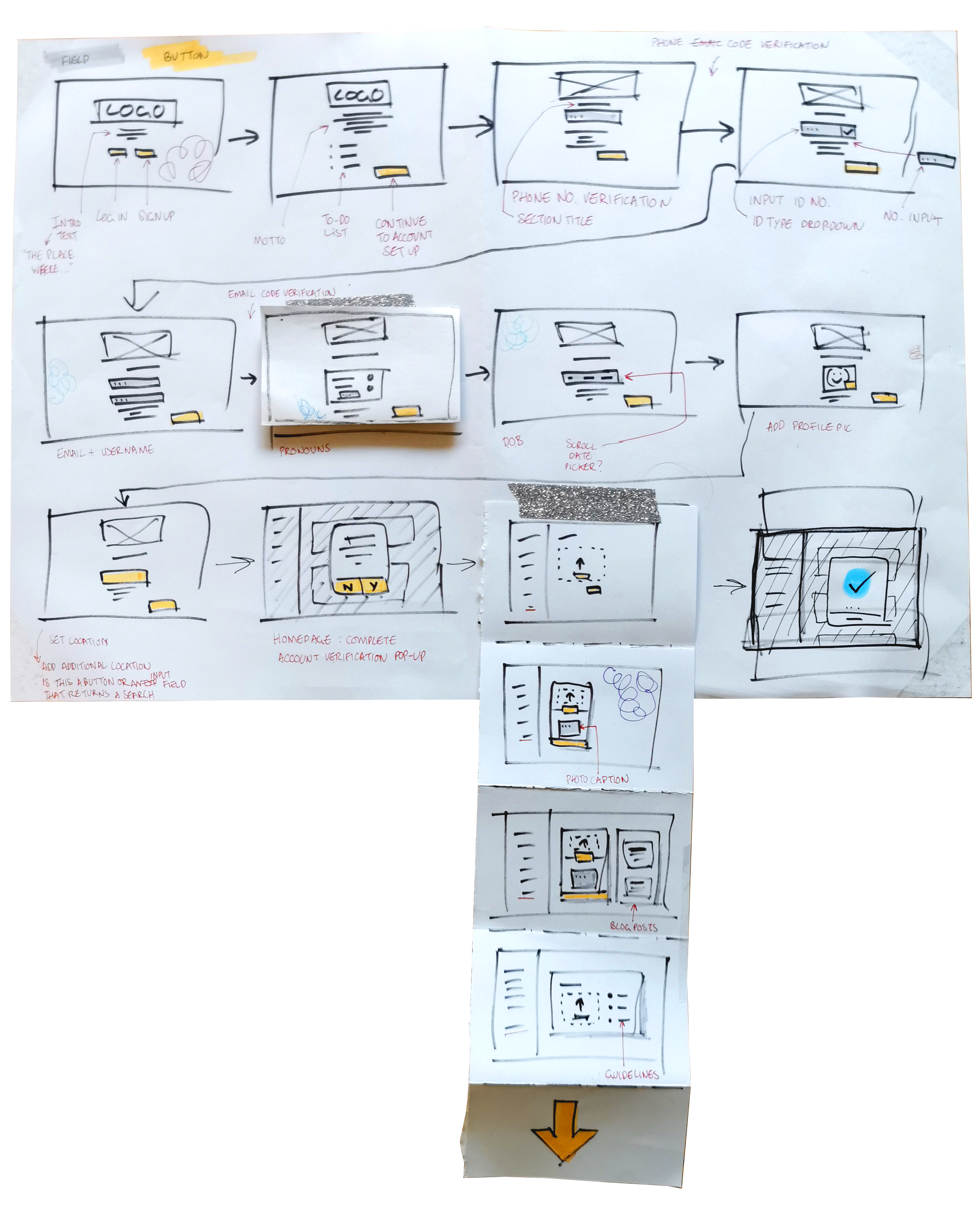
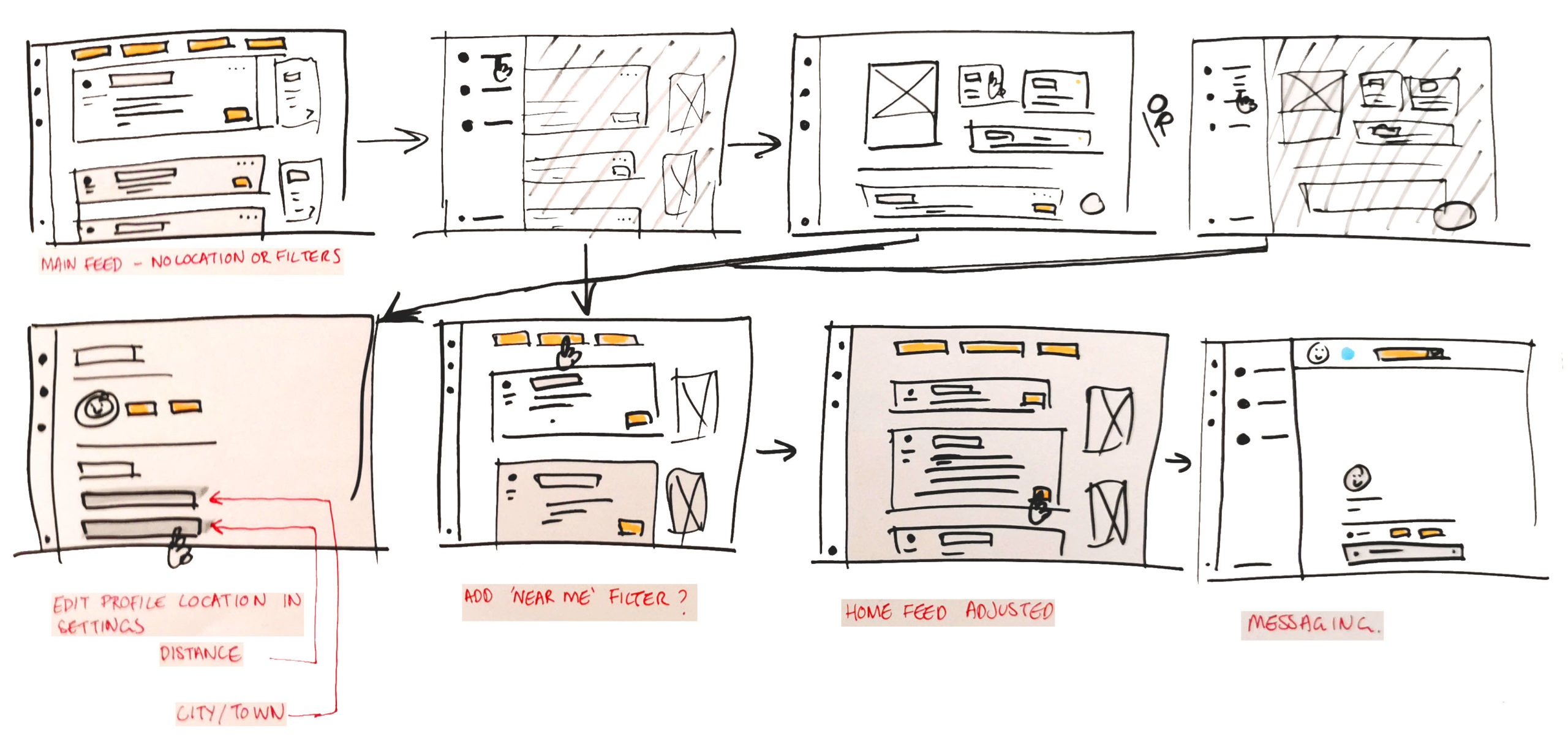
In 12 weeks, I developed a functional slice of a high-fidelity prototype for a social media site dedicated to queer migrants.
The prototype was accompanied by extensive design documentation.
Context
Moving to a new country or city is an exhilarating experience. Everything is different and fresh; you can’t wait to get out there and soak up all the new experiences. But moving can also be crushingly lonely. Suddenly, nobody laughs at your jokes and friend groups are already tightly established with seemingly no wiggle room.
However, the struggle to find your feet in established communities leads to feelings of lonelinessand isolation. Within the queer and transgender community (Q/T), this is especially pertinent. This project aimed to bridge that gap
between loneliness and community building by helping individuals find their feet in new places. The resulting product is not queer-exclusive but is rather designed around queer-specific experiences to make a more accessible product for all people.
Problem Statement
“I need a way to easily and safely connect with like-minded people in my new city because it can be stressful when the only options are big groups.”
Hypothesis
“I believe that by creating intentional meet-up solutions based around individuals and their values, newcomers can build strong communities.”
Reframing after User Interviews
I began by conducting a series of user interviews with a small handful of people with different sexualities and emigration backgrounds.
Synthesising the interview data, I saw my initial assumptions were wrong. I assumed the main problem of meeting new people was that events are often big groups, making them stressful. But the biggest problem my users identified was safety and knowing if people were genuine rather than trolls. So, based on that and my users’ preferred ways to meet people, I developed the following two problem statements.
Revised Problem Statement 1
“Queer people need a safe way to meet locals so they can make friends with similar life experiences.”
Revised Problem Statement 2
“New arrivals need a secure, low-effort method to find in-person hobbies in their new area so they can start building communities.”
Iterative Design
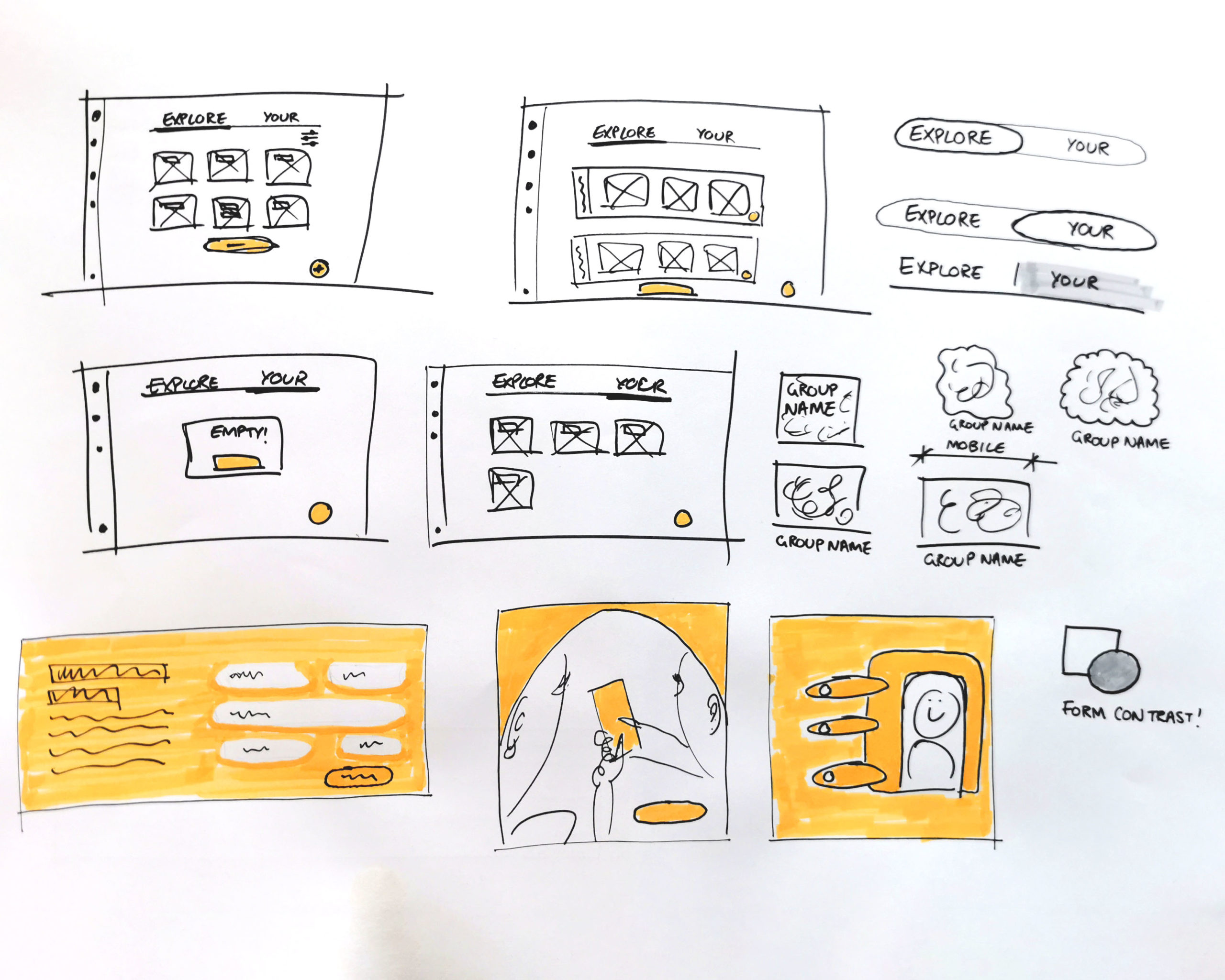
Despite the short project time frame, I went through multiple design iterations, each one building upon user feedback from the last round of testing.
The first iteration used hotspot usability testing using a combination of Figma and Maze with a low-fidelity prototype. In total, 19 people completed the initial testing giving the flow a usability score of only 61. Digging into the data, I saw that misclick rates were very low and that participants were actually abandoning the test because of objections to the onboarding process.
Iteration two responded to this feedback and made use of improved copy and status indicators to allow users to plan their time better.
With iteration three, I returned to hotspot testing with a more fleshed-out prototype. At this point, I discovered the true benefit of multiple rounds of testing! While most participants were happy with the onboarding process stating that it was clear and straightforward, several found it far too long. I was surprised at this feedback arriving only in the last round of testing as I had expected to receive it straight away.
Participant 9: “I’ve tried to skip some steps because I wanted to take a look at the product first. Personally, I don’t like to fill out registration at the very beginning before viewing the product.”
Participant 4: “Long and tedious. If this were a real-world meet-up app I would never use it.”
Designing for Accessibility
Design Concept
The key design decision for Wavelength was usability through contrast. Almost every field element is held within a container to clearly state to the user the hierarchy of elements.
The outermost part of the container is always a box with 90° corners, while everything within the containers is soft and rounded. Interactable elements are therefore also rounded.
The logo forms the beginning of the hierarchy with rounded forms. Then comes the containers with sharp edges, and finally interactable field elements which are again round. A wavelength of visual hierarchy if you will.
Visual Impairments
Users with visual impairments are further aided by the extensive use of containers and their distinctive visual design. Even when zoomed in to 400%, users will know when they encounter a line and a colour change that important content is not far away.
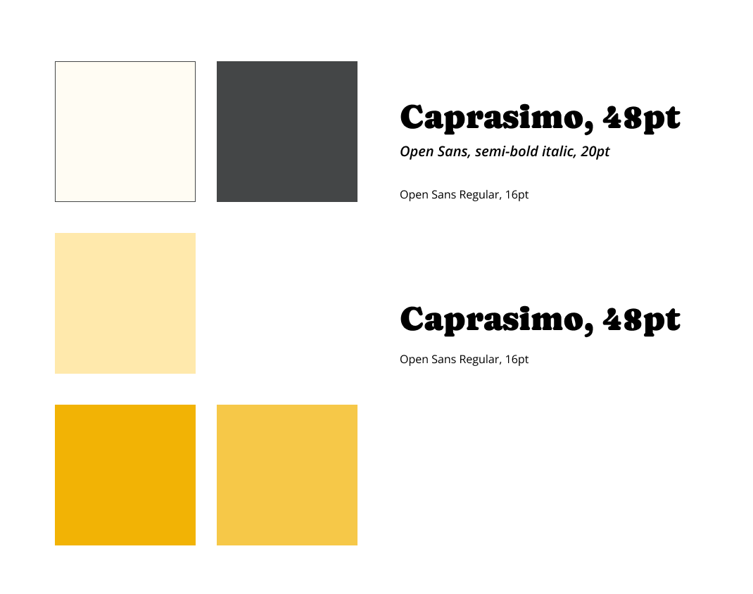
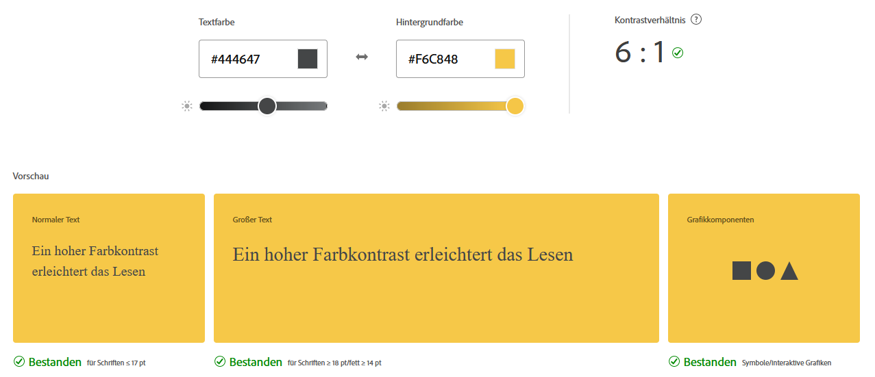
All colour combinations within Wavelength achieve AA standard at a minimum, with the majority achieving AAA standard.
Copy
At each stage, the copy is intended to serve the user and set the tone for initiating casual conversation. Everything is written with sensitivity and inclusivity in mind remembering users can have any variety of sexualities, gender expressions and requirements.
In areas that remind the user to engage with the community, the copy aims to encourage and inspire by empowering the user to be themselves rather than a perfect representation.
Neurodivergence
For neurodivergent users subject to overwhelm, I have kept the design flat and minimal to reduce visual noise. By adding a big heading to each section, the user can see at a glance where they are, even if they forget the meaning of the highlighted icon in the navigation bar.
I further reduced cognitive overload by sticking to an analogous colour scheme.
Reflection
In terms of the theoretical approach to the design, I took an ethics-first approach. It is practically a common practice for social media to engage in emotional manipulation of users either directly or indirectly by sprinkling deceptive patterns everywhere. By adding the blog, I hoped to bring users into the discussion about important topics such as the limits of verified accounts and general accountability throughout the digital community.
Despite those efforts:
I see I designed with blinkers on. At the start of the project, I assumed everyone would come in with good intentions. I focused on onboarding and verification but didn’t explore what happens after people connect. I didn’t test for toxicity, moderation, or conflict, because in a twelve week uni project, that felt too big. But also… maybe I just didn’t want to look at the mess once I was elbows deep in the project. And that doesn’t sit right.
We know social media often brings out the worst in people. And yet I created a space as if that wouldn’t be a problem. Still, the process taught me a lot: about design ethics, about assumptions, and about what I want to tackle next.
Next steps for the project will investigate ethical design in more detail. Testing will include differing moderation approaches and how to tackles ‘verified’ accounts that make an impact.


